Sankey diagrams are a great way of visualizing the flow of data, where the width of
each flow is based on its
quantity or relative weight. Like a picture that speaks more than a thousand words, a Sankey diagram speaks more than a
thousand pie charts. Perfect use cases of these diagrams are to visualize the flow of materials and money, but there
is no limit on how creatively
they can be used.
Here is a sample Sankey that shows the vacation budget flowing into different heads.
 |
| Sankey diagram for a vacation budget |
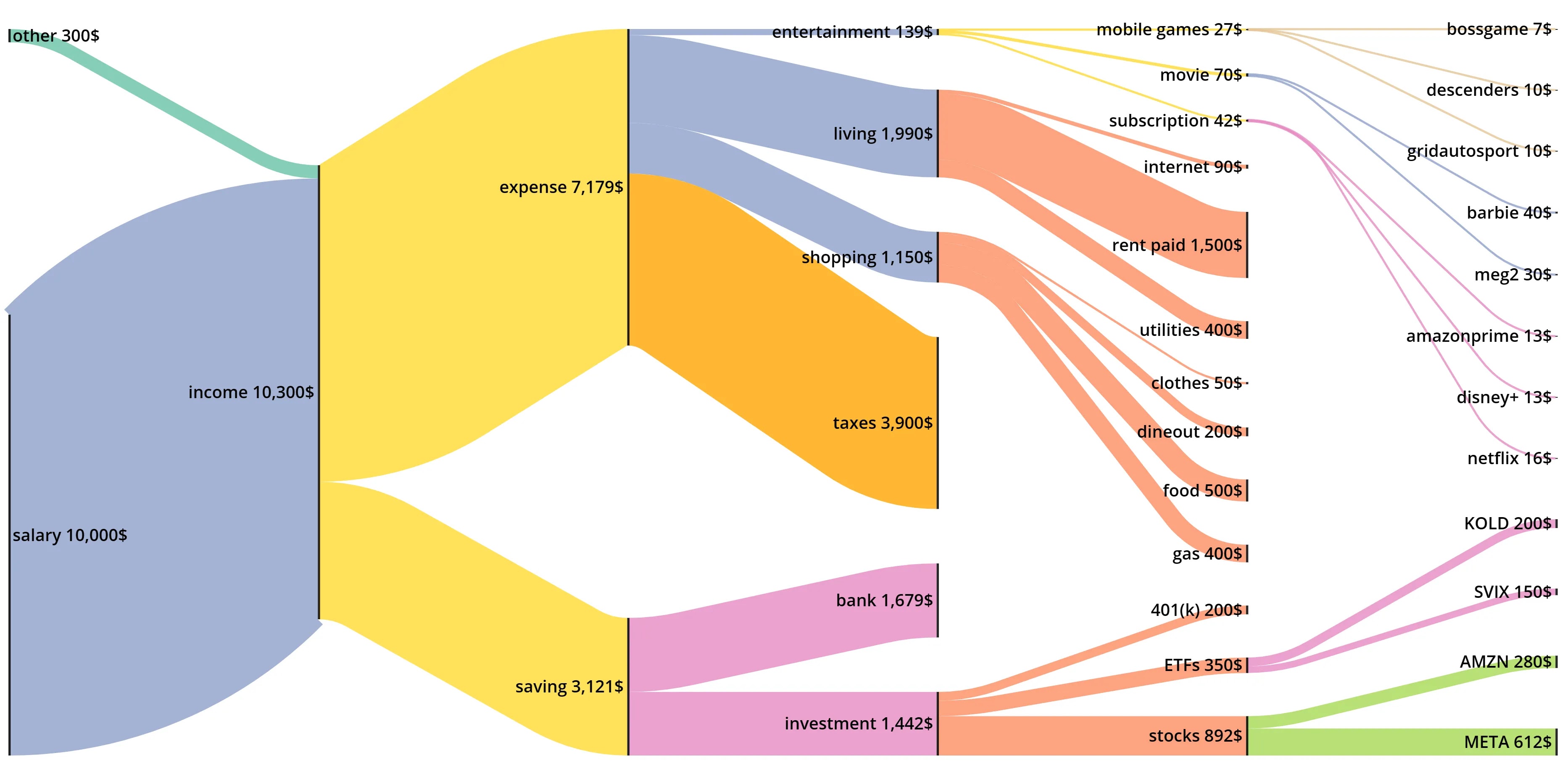
The example below shows a monthly budget split into multi-level heads.
 |
| Sankey diagram for a monthly budget |
The example below shows inflation-adjusted revenue from music sales based on media format from 1973
till 2019. Data source
RIAA.
 |
| Sankey diagram for music revenue based on media
type sales |
Below are some resources where you can create Sankey diagrams.
SankeyDiagram.net
 |
| Sample at SankeyDiagram.net |
I kept this in the beginning of the list because it is the simplest to
use. Creating Sankey diagrams at
SankeyDiagram.net is very easy to use and free. Just go to the
website, enter your data and see the diagram
evolve in real time. It has
a simple input format, a few settings and the ability to export the diagram in various formats like PNG
and SVG. It automatically selects colors for you and also lets you specify colors for each flow. A
useful feature here is that you can use a '?' for the program to automatically calculate the value based
on the lower nodes. Thanks to
Jonas Lorenz for
creating and publishing this
open-source tool.
SankeyMATIC.com
 |
| Sample at SankeyMATIC |
SankeyMATIC.com
has a UI which is loaded with lots of customizations to choose from. There are controls to help
customize the size of the canvas, margins, heights and spacing of nodes, default colors, opacity, curviness
etc. The data input format is simple and it provides you a choice to select predefined coloring themes. With
this tool, also have total control of the opacity, font positioning, size and highlighting. It lets you
export the diagram as a PNG at a size of your choice. I really miss the ability to let it auto-calculate the
values of higher nodes based on the values in the lower ones.
Sankey Diagram Generator by Dénes Csala
 |
| Sample at Sankey Diagram Generator |
This free Sankey diagram generator at
sankey.csaladen.es provides a lot of control on
the configuration part. Each flow can be defined more definitively in terms of colors and layers. The
nodes can be freely moved around the canvas by dragging with the mouse pointer. The application lets you
save the diagram as a PNG image. Thanks to Dénes Csala for creating and publishing this
open-source tool.
Sankey using Google Charts
 |
| Sample at Google Charts |
If you are okay with a bit of HTML and JavaScript programming, Google
Charts has a chart library that you can embed in your web page and display interactive charts. The
Sankey diagram will be rendered using HTML5/SVG technology to provide cross-browser compatibility
(including VML for older IE versions) and cross platform portability to iPhones, iPads, and Android. There are loads of options to customize which I will cover in a later post. Head over to Google Charts'
Sankey
Diagram for more details on how to create these charts.
The simple Sankey diagram below was made with Google Charts and depicts the top 10 Wikipedia pages and their source based on page views for
the year 2022. Hover your mouse pointer, or tap, over the nodes and flows to see the data. [Data source: Wikipedia] [static image sample]
The Sankey diagram below, which was made with Google Charts, shows UK studio albums released by The Beatles grouped into genres. [Data
source: Wikipedia] [static image sample]
You will come across many other tools to create Sankey diagrams. The ones I chose to
write about here are the ones that are freely accessible and fairly easy to use. Sankey diagrams can be used to
depict much more complex scenarios of data or
materials flow. If you have a comment, please drop it in the comments section below.


No comments:
Post a Comment